Intro to Cumulative Flow Diagrams
In this episode a overworked team leader carries out a conversation with an Agile manager to help her present a business case to increase staff.
Team Leader: We are completely overloaded, we keep falling more and more behind and quality is suffering.
Agile Manager: How do you plan on resolving the situation?
Team Leader: Well I've been telling management that we need more staff, but they don't seem to be listening.
Agile Manager: Maybe they just have a hard time seeing the impacts of such a low staffing level.
Team Leader: You think so?
Agile Manager: Maybe. Imagine you're grocery shopping and you're prepared to check out. Since you are a busy professional you would like to expedite your checkout by stepping into the line that will give you the shortest wait time. How would you determine the best line to stand in?
Team Leader: Well, I'd probably take a moment, assess the number of people in each line, and how fast the line appears to be moving. Based on that I'd make a judgment call and pick a line.
Agile Manager: That's probably what I'd do too. It sounds to me like the act of physically observing the length of the line and how fast people are being processed is a key driver in the decision. How easy is that observation to make in our virtual world of project plans and tasks?
Team Leader: Well, that's a little tougher but, as a manager, I see the amount of work we're asked to do and it's too much.
Agile Manager: I'm sure it is. What if all of the information is there but it's a in a format that's a little hard for your management team to process? What if we had another way of organizing the information you have in your head that helps management understand the impact of the current staffing level?
Team Leader: Ok, I'm listening...
Agile Manager: Great. Let's return to the grocery store example. For the sake of discussion, let's assume that the grocery store consists of three lanes. We want to determine which lane is currently the most efficient at moving customers through. We can start this process by plotting the number of people standing in line across a given timeframe.
Arrivals by Minute
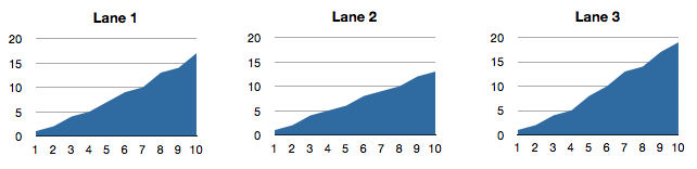
Agile Manager: So let's take a look at what type of information this simple chart tells us. The first piece of information we can look at is the Y-Axis. This tells us the number of people that have arrived at the lane over a 10 minute period. You can see that, in lane one, five people have lined up by the fourth minute and a total of 17 by the 10th minute. This is the total amount of work to be completed by the cashier, they have to check out 17 people in 10 minutes.
Team Leader: Well, that's interesting, but nothing to write home about. How does that help me?
Agile Manager: Well, it doesn't on it's own, but there's another interesting metric hidden in that simple line. It tells us how fast the line is filling up.
Team Leader: Uh, ok...
Agile Manager: You see, by examining the slope of the line, we can tell how fast people are walking up to stand in line. We call this the 'Arrival Rate'. If the line is running completely horizontal then we know that no additional people have arrived in line during that time. Lines with a steeper slope, such as the one we see between minute six and seven of lane three tells us that quite a few people are arriving at the lane.
Team Leader: Oh, I see, it's pretty clear once you explained it to me. Generally speaking you could take an average over time and get a pretty good idea about how many people use each lane.
Agile Manager: You sure could. We now know that this graph can help us visualize the number of people arriving at the checkout line, which is a key component to how you would make a decision about what line to join. We also know that knowing the arrival rate alone isn't sufficient to making a good decision about your lane choice. The missing piece of information is how fast people are being checked out. How do you think we gauge that?
Team Leader: I don't know but I'm sure you're gonna tell me!
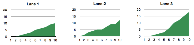
Agile Manager: Of course I am, but only because you made me! Again we'll turn to a chart as our visualization tool. This chart, which is essentially the same as the arrivals chart, will plot the departures from our queue. As with the arrival rate, the Y-axis shows the total number of people that have completed checking out for that lane and the X-axis represents time. With this chart, we can see that about 18 people have completed checkout over a ten minute period. Once again, the slope also gives us an indication of the rate at which customers are being checked out, which we call the 'departure rate'.
Departures by Minute
Team Leader: All right, so now we have charted the two key data points I need to make my decision, but how do I use it?
Agile Manager: Good question. These individual graphs don't really help us make decisions on their own, but combined they tell us an interesting story.
Cumulative Flow Diagram
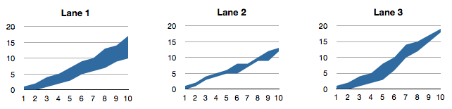
Agile Manager: These area graphs are created by overlaying the arrival rate graph with the departure rate graph. The relationship between the arrival rate (top line) and departure rate (bottom line) tells us whether or not the checker is able to keep up with demand. Consider lane one, the overall slope of the arrivals is increasing at a greater rate as the slope of the departures, meaning the checker can't keep up with demand and the line is continuing to grow. This checker probably isn't having a very good day. Look at lane three. What can we see happening there after 10 minutes?
Team Leader: Well in that case, the arrival rate is slower than the departure rate, so the checker is getting people checked out faster than people are arriving in her lane. It looks like she should get some of lane one's patrons to come join her line.
Agile Manager: Sounds like you've got it all figured out. Looking at lane two, the arrivals and departures are both pretty even, I'd say that lane two is pretty much in a state of 'flow'.
Team Leader: I'm tracking with you so far, this is a great way to track individual checker performance.
Agile Manager: I wouldn't go that far, but once aggregated it paints a pretty good picture of the store's ability to keep up with demand.
Agile Manager: There are a couple of other things to notice about this graph. First, it's ability to report on the amount of work that each lane needs to get done at any given time. Consider lane three again, by looking at the Y-axis we can see that at minute 5, we've got 8 people that have arrived at the lane. Scanning downward we can see by the bottom line that 3 have completed checkout. Doing the math then tells us that there are 5 people standing in line during minute 5 of our sample. That is what we call 'Work In Progress'.
Team Leader: That's interesting, I'm not sure why though.
Agile Manager: Well, it's interesting for a couple of reasons, but first I'd like to talk more about that X-Axis of our graph. Let's turn our eyes to lane one, around the 4 minute mark. You'll notice that we've got 5 arrivals. That means that at minute 4 of our sample, the 5th person walked up and stood in line. The real question is, when did he leave?
Team Leader: That depends, can he cut the line?
Agile Manager: No, for the sake of this discussion he stayed in his proper space in line.
Team Leader: Well, then he'd be the 5th one to get checked out.
Agile Manager: Exactly. Let's look at the departures now, at what point did we hit our fifth departure?
Team Leader: Minute 6.
Agile Manager: Yes. So looking along the X-axis will give us the amount of time an individual stood in line, in this case it's two minutes. We call this the 'cycle time'. One of the more interesting things about these graphs is that they show the relationships between work in progress and cycle times. Let me direct you to another area of interest in lane one: minute seven. Before I do, however, answer one question for me. What was the amount of work in progress at minute 4, when the 5th patron joined the line?
Team Leader: Well, based on what you've said previously, three.
Agile Manager: Correct. So at minute four, with a work in process of three, each patron takes about two minutes to get through the line right?
Team Leader: Yes
Agile Manager: So, now back to minute seven. Can you tell me what the work in progress is at this point?
Team Leader: Easy. Four.
Agile Manager: Right again. Now, following that across, what is the average cycle time at minute seven?
Team Leader: Umm, three minutes?
Agile Manager: Correct again. Notice that an increase in work in process leads to an increase in average cycle times. In other words, it just takes longer for people to get through the line.
Team Leader: Wow, that's really interesting.
Agile Manager: I think so. Now look at lane two. What do you think about it? If you had this information in front of you, what lane would you pick to stand in in order to get out of the store as quickly as possible?
Team Leader: Probably lane two, but lane three looks promising as well.
Agile Manager: Yes, I believe based on our data, either option is a good one for getting through the system quickly and out the door. And now back to the original objective, knowing what we know about how to visualize the work at individual lanes in a grocery store, how do we apply this to knowledge work and have some hard data behind your request for more staff?
Team Leader: Well, I suppose the 'patron' in our grocery example could represent a unit of work my team is supposed to process and we can track the arrival of work into and out of my department on a chart such as this on a daily or weekly basis. It will help us show in a more concrete form whether or not we have more work than we can handle.
Agile Manager: What about work in progress? Higher work in progress means longer cycle times. What if you put a price on the items in the queue? Longer cycle times would mean potentially delayed revenue opportunities for the company. Could you show that to management? Would that give them the information they need in a concise, no-nonsense way?
Team Leader: I think it could. I'm definitely going to give this a shot. Wish me luck.
blog comments powered by Disqus